|
|
Topic Originator: jake89
Date: Sat 22 Jun 17:18
Apologies if already shared
Click here
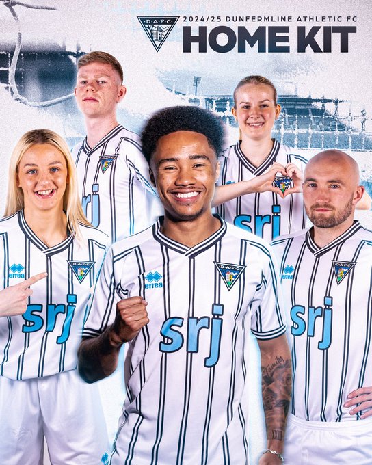
Looks smart but I`d prefer if the SRJ and Errea logos were red.
|
|
|
|
|
|
Topic Originator: Angus_W
Date: Sat 22 Jun 17:33
Mmmmmmm………..
Nothing a black felt pen won’t sort out, start to win in it & I’ll change my tune.
‘Hello my name is Jefferson - I’m happy to be here let’s go!’
|
|
|
|
|
|
Topic Originator: AdamAntsParsStripe
Date: Sat 22 Jun 17:36
Yeah red sponsor would have looked way better and stood out plus black shorts.
It’s decent enough though.
Zwei Pints Bier und ein Päckchen Chips bitte

|
|
|
|
|
|
Topic Originator: Raymie the Legend
Date: Sat 22 Jun 17:53
Collar is pretty wide. Would have been neater with a tighter fit.
It’s an ok design

It`s bloody tough being a legend
Ron Atkinson - 1983
|
|
|
|
|
|
Topic Originator: jake89
Date: Sat 22 Jun 17:57
No sure if it`s the away top or a training top but the black and red top looks really smart.
|
|
|
|
|
|
Topic Originator: Jeffery
Date: Sat 22 Jun 18:00
Not really in a position to complain as I don`t often buy a top, but I seem to remember quite a bit of negative feedback last year from people not liking the blue sponsor. It`s a shame the same has been done again as had the blue bits been red it would have been a really nice top.
Goalie one looks really good.
|
|
|
|
|
|
Topic Originator: Par
Date: Sat 22 Jun 18:38
Would be better with a black or red logo, but unsure if this is the sponsor, the club or Errea who decide the colour of the sponsor. The club should know that blue was criticised last year and taken that into account for this year if they had a say as we are always getting told what the fans says count.

Post Edited (Sat 22 Jun 18:40)
|
|
|
|
|
|
Topic Originator: hurricane_jimmy
Date: Sat 22 Jun 18:59
Have to admit I`ve found the Errea kits pretty stinking tbh - that one looks like it`s been done in MS Paint!
|
|
|
|
|
|
Topic Originator: cfad
Date: Sat 22 Jun 19:10
Quote:
Jeffery, Sat 22 Jun 18:00
Not really in a position to complain as I don`t often buy a top, but I seem to remember quite a bit of negative feedback last year from people not liking the blue sponsor. It`s a shame the same has been done again as had the blue bits been red it would have been a really nice top.
Goalie one looks really good.
Goalie top could not look worse than last year if it was a bin bag
|
|
|
|
|
|
Topic Originator: Dave_1885
Date: Sat 22 Jun 19:19
Dont like the pin stripes on it or the logo - 2/10
Post Edited (Sat 22 Jun 19:20)
|
|
|
|
|
|
Topic Originator: doctordandruff
Date: Sat 22 Jun 19:39
My son has come home in one, and it looks really smart in real life. Way better than the pics
|
|
|
|
|
|
Topic Originator: dafc-chris1
Date: Sat 22 Jun 19:40
That kit is beautiful
|
|
|
|
|
|
Topic Originator: StevenPar77
Date: Sat 22 Jun 19:44
It is a crackin` kit, in my opinion.
|
|
|
|
|
|
Topic Originator: jake89
Date: Sat 22 Jun 19:58
I don`t mind the blue but don`t understand where it comes from. SRJ use black, white and orange so the blue is just a bit odd. Reminds me of the old Newcastle tops.
It does look smart though. Prefer it to last years.
|
|
|
|
|
|
Topic Originator: Alter Ego

Date: Sat 22 Jun 21:26
|
|
|
|
|
|
Topic Originator: PARrot
Date: Sat 22 Jun 22:37
I would think that if the sponsors pay to have their name on a kit, they would be 100% responsible for the colour of their logo.
|
|
|
|
|
|
Topic Originator: Parfect69
Date: Sat 22 Jun 23:28
Got to be black shorts?
|
|
|
|
|
|
Topic Originator: Roger Daltrey
Date: Sat 22 Jun 23:33
We are black, white and red.
Absolutely confused by the blue 2 years in a row, particularly when SRJ don`t use it on their advertising or website.
Just sh:te.

|
|
|
|
|
|
Topic Originator: parsmad68
Date: Sat 22 Jun 23:52
Black and blue
A bit like most of our squad last year.
|
|
|
|
|
|
Topic Originator: SusieQ
Date: Sun 23 Jun 00:08
I like it but always prefer the pinstripe strips. Logo is crap again, but I`m guessing blue is SRJ choice so we`re stuck with it, unfortunately.
At least they didn't mess with the badge which I really effin hate 👍🏼
COME ON YE PARS!
Post Edited (Sun 23 Jun 00:09)
|
|
|
|
|
|
Topic Originator: rsmith
Date: Sun 23 Jun 08:59
Red GK top is smart. Like the vintage gold badge on it. Would have made a good away top in my opinion. Also shows how much better the sponsor looks in black.
Post Edited (Sun 23 Jun 09:09)
|
|
|
|
|
|
Topic Originator: steaua
Date: Sun 23 Jun 14:28
Being a traditionalist , sorry, but not for me. However, I think the younger fans will like ie.
|
|
|
|
|
|
Topic Originator: SusieQ
Date: Sun 23 Jun 15:46
Younger Marv lol - I`m 50 & love it 🤪🤣🫶
COME ON YE PARS!
|
|
|
|
|
|
Topic Originator: RhinoPars
Date: Sun 23 Jun 16:07
On the whole I think it is a nice kit and like the shorts and socks. However, like many others I would have much preferred red for the sponsor’s logo. I think they would sell more if they had done that. Also don’t like panels on the back and would prefer to see stripes all the way up the back as well. You could easily read red numbers on these pinstripes. I suppose having a panel it is partly about have somewhere to add names above the numbers. At first glance not keen on goal keeping kit and the dark Errea logo area on the red away strip is awful.
Post Edited (Sun 23 Jun 16:08)
|
|
|
|
|
|
Topic Originator: dafc-chris1
Date: Sun 23 Jun 16:56
The red strip is the training top
|
|
|
|
|
|
Topic Originator: buffy
Date: Sun 23 Jun 17:01
Alas reading numbers on stripes isn’t as easy as you’d think (from experience) no matter what colour the number is. The plainer it is imo.
”Buffy’s Buns are the finest in Fife”, J. Spence 2019”
|
|
|
|
|
|
Topic Originator: parsfan
Date: Sun 23 Jun 17:22
It`s okay, we`ve had a lot worse.
I preferred the blurred version in the build up. Looked like candy stripes again and, as much as they`re my favourite style, I didn`t think we`d be doing them again so soon. I suppose watching through my fingers, like much of last season, might give the same effect.
~~~~~~~~~~~~~~~~~~~~~~~~
The universe is ruled by chance and indifference

|
|
|
|
|
|
Topic Originator: SharpPar
Date: Sun 23 Jun 17:35
Quote:
dafc-chris1, Sun 23 Jun 16:56
The red strip is the training top
No it isn’t. The red top on sale is the GK top. I think there might be some red training tops to come but they aren’t on sale yet
|
|
|
|
|
|
Topic Originator: Berry
Date: Sun 23 Jun 17:51
During the Open Day half the squad had the red top on which looked very much like the training top.
Mehmet GK strip is also red.
|
|
|
|
|
|
Topic Originator: DBP
Date: Sun 23 Jun 20:02
“I don`t mind the blue but don`t understand where it comes from. SRJ use black, white and orange so the blue is just a bit odd. “
If you heard from EEP to town and look at the bill boards on your left near the roundabout, the srj billboard’s text looks the same as on the strip- same blue
|
|
|
|
|
|
Topic Originator: KAPP-Par
Date: Sun 23 Jun 21:00
Not keen on the blue it just doesn’t look right. Purvis changed their logo from original green and blue which they still use today to red which looked great.
|
|
|
|
|
|
Topic Originator: RhinoPars
Date: Sun 23 Jun 22:10
Quote:
dafc-chris1, Sun 23 Jun 16:56
The red strip is the training top
Ah - thanks for the clarification dafc-Chris
|
|
|
|
|
|
Topic Originator: RhinoPars
Date: Sun 23 Jun 22:12
Quote:
buffy, Sun 23 Jun 17:01
Alas reading numbers on stripes isn’t as easy as you’d think (from experience) no matter what colour the number is. The plainer it is imo.
Don’t agree with you here. We have had red numbers on pinstripes before and they were easy to read. Maybe an issue with thick stripes though.
Post Edited (Sun 23 Jun 22:15)
|
|
|
|
|
|
Topic Originator: jake89
Date: Sun 23 Jun 22:39
Quote:
DBP, Sun 23 Jun 20:02
“I don`t mind the blue but don`t understand where it comes from. SRJ use black, white and orange so the blue is just a bit odd. “
If you heard from EEP to town and look at the bill boards on your left near the roundabout, the srj billboard’s text looks the same as on the strip- same blue
I assumed that`s because it was near the stadium. The logo outside their HQ is black and white. Same on the vans I`ve seen.
|
|
|
|
|
|
Topic Originator: buffy
Date: Sun 23 Jun 22:55
Quote:
RhinoPars, Sun 23 Jun 22:12
Quote:
buffy, Sun 23 Jun 17:01
Alas reading numbers on stripes isn’t as easy as you’d think (from experience) no matter what colour the number is. The plainer it is imo.
Don’t agree with you here. We have had red numbers on pinstripes before and they were easy to read. Maybe an issue with thick stripes though.
Rhino I meant in relation to reporting on the game. It’s easier to see numbers when it’s a plain back.
”Buffy’s Buns are the finest in Fife”, J. Spence 2019”
|
|
|
|
|
|
Topic Originator: Rigger Al
Date: Wed 26 Jun 06:39
Anyone know if the new shirt is avaliable yet, got family coming out to Houston on Sunday
|
|
|
|
|
|
Topic Originator: Par
Date: Wed 26 Jun 07:54
Yes, the club shop opens today, 10 till 4, and home shirts are available
|
|
|
|
|
|
Topic Originator: Rigger Al
Date: Wed 26 Jun 08:11
Quote:
Par, Wed 26 Jun 07:54
Yes, the club shop opens today, 10 till 4, and home shirts are available
Thank you par
|
|
|
|
|
|
Topic Originator: Alter Ego

Date: Wed 26 Jun 09:08
|
|
|
|
|
|
Topic Originator: parsfan
Date: Wed 26 Jun 13:12
Quote:
Alter Ego, Wed 26 Jun 09:08
Anyone know when the away kit/training kit will be available?
Nope, but away kit all black I`ve heard (or mostly black).
It might also explain white shorts for the home kit.
~~~~~~~~~~~~~~~~~~~~~~~~
The universe is ruled by chance and indifference

|
|
|
|
|
|
Topic Originator: Taxipar
Date: Wed 26 Jun 20:37
Think the blue symbolises the colour of a pain of glass. That’s the only explanation I can come up with
A par since 1985
|
|
|
|
|
|
Topic Originator: Par
Date: Thu 27 Jun 10:51
Quote:
Alter Ego, Wed 26 Jun 09:08
Anyone know when the away kit/training kit will be available?
Training kit available in the club shop now
|
|
|
|
|
|

